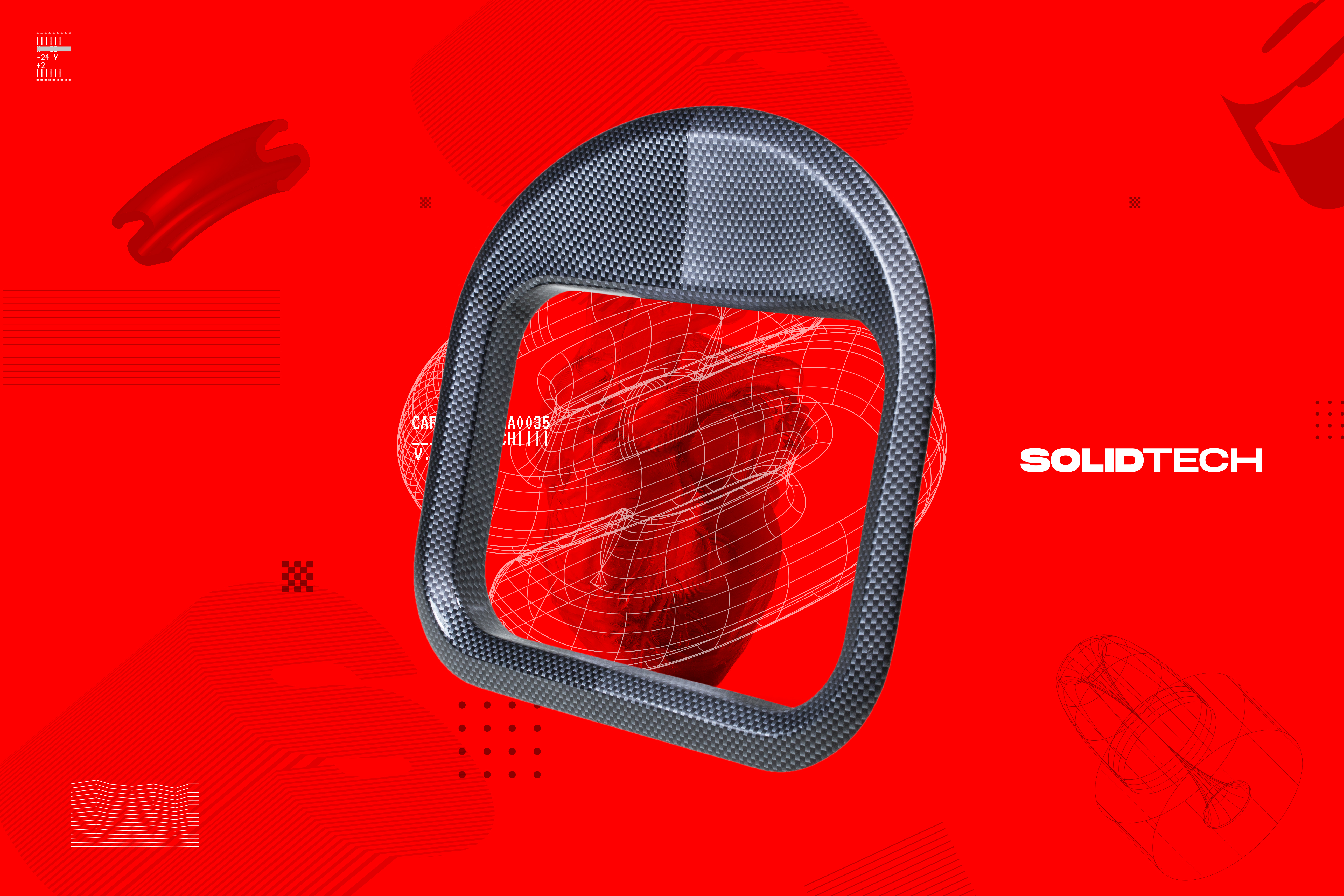
SOLIDTECH
2020
Creative Direction | Rebranding
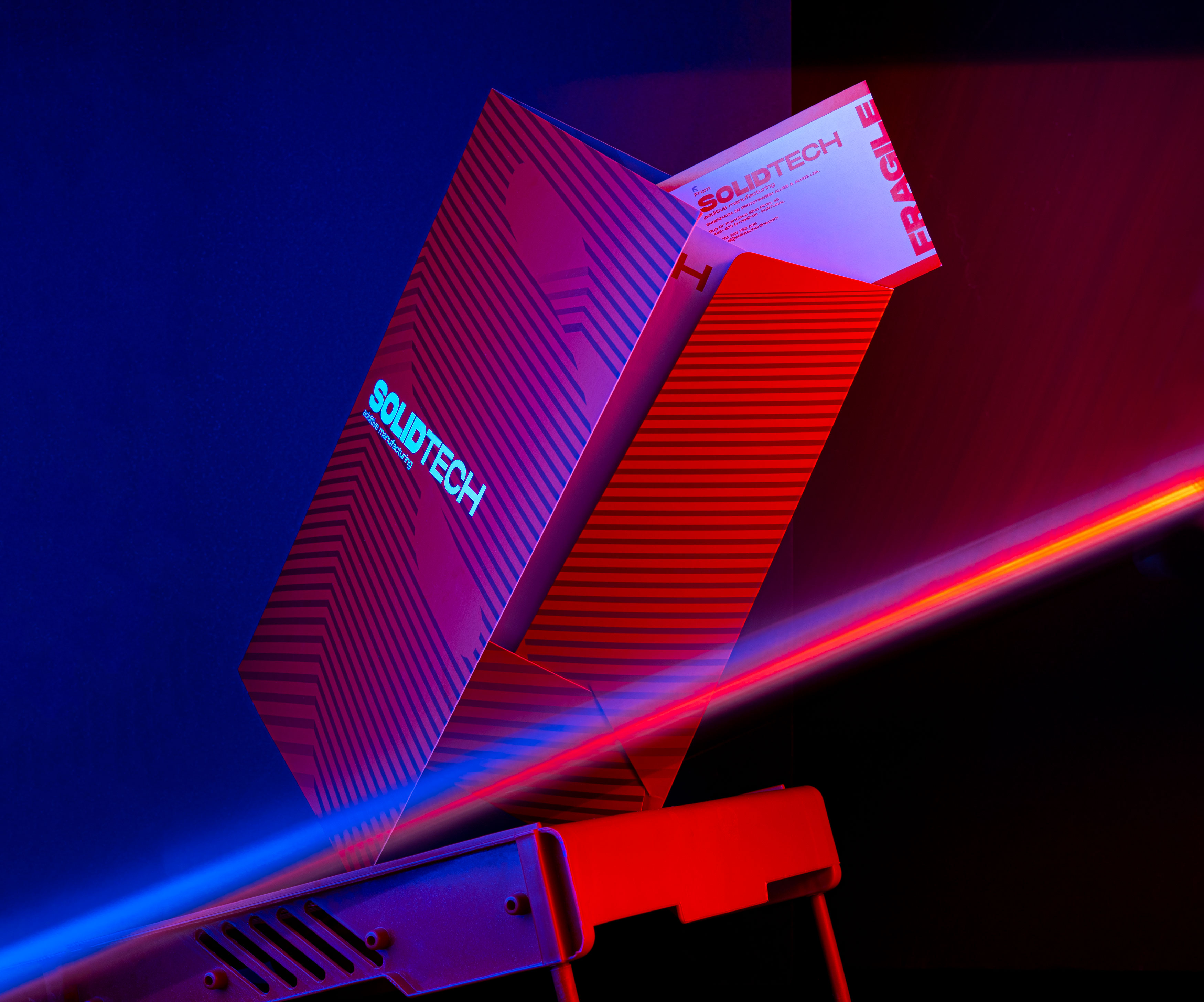
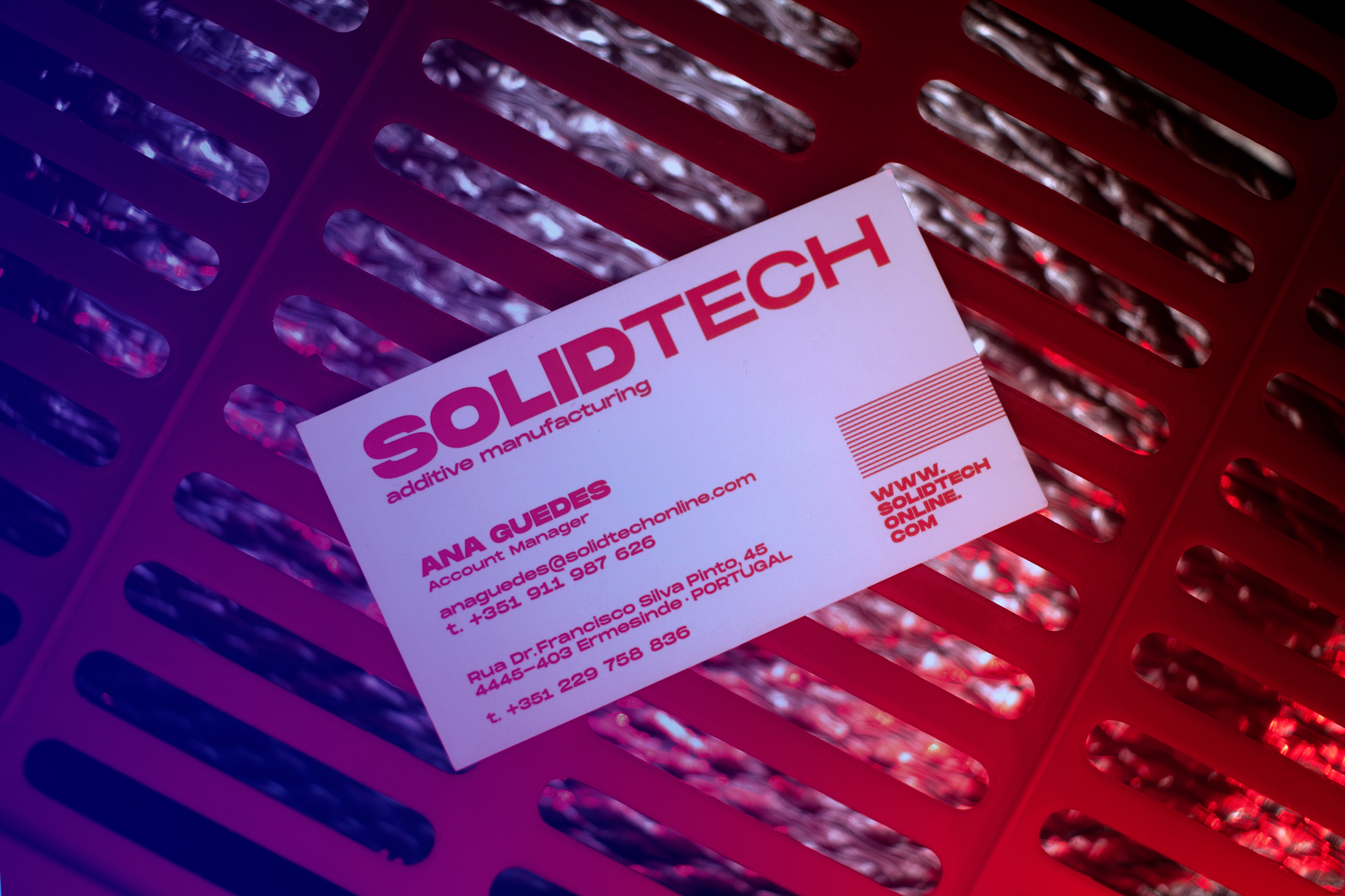
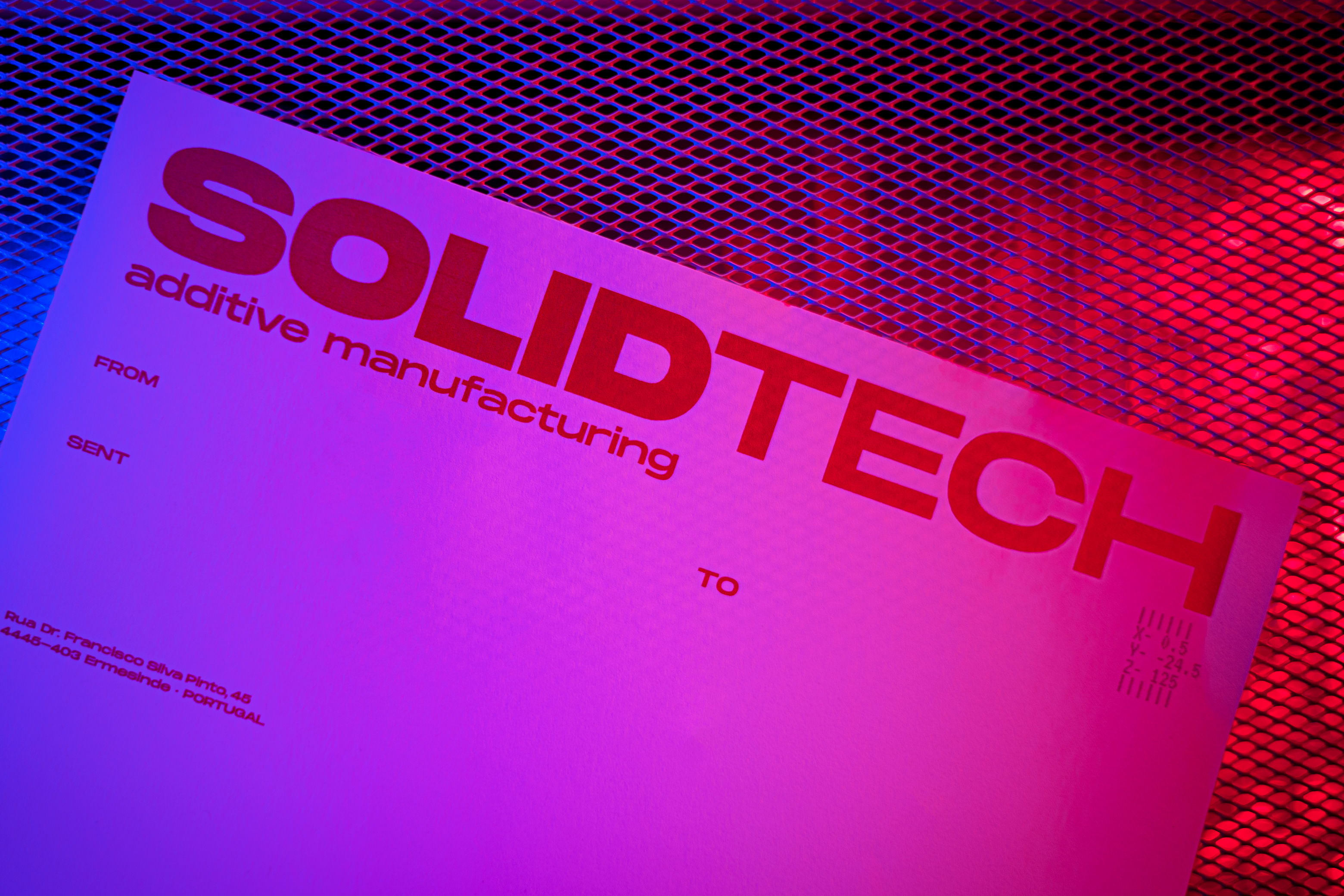
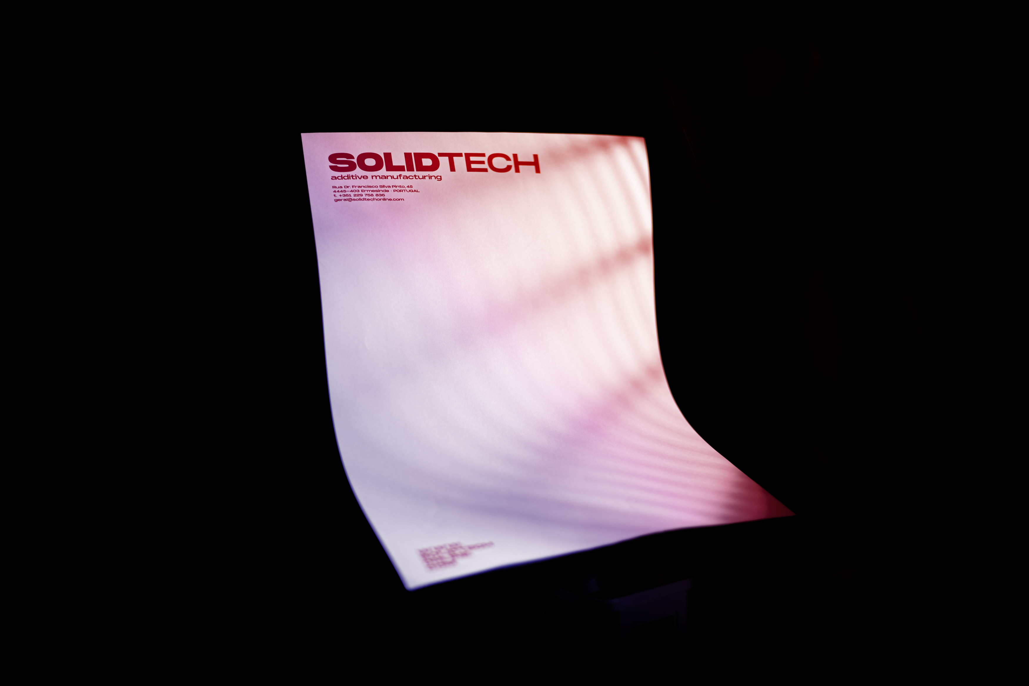
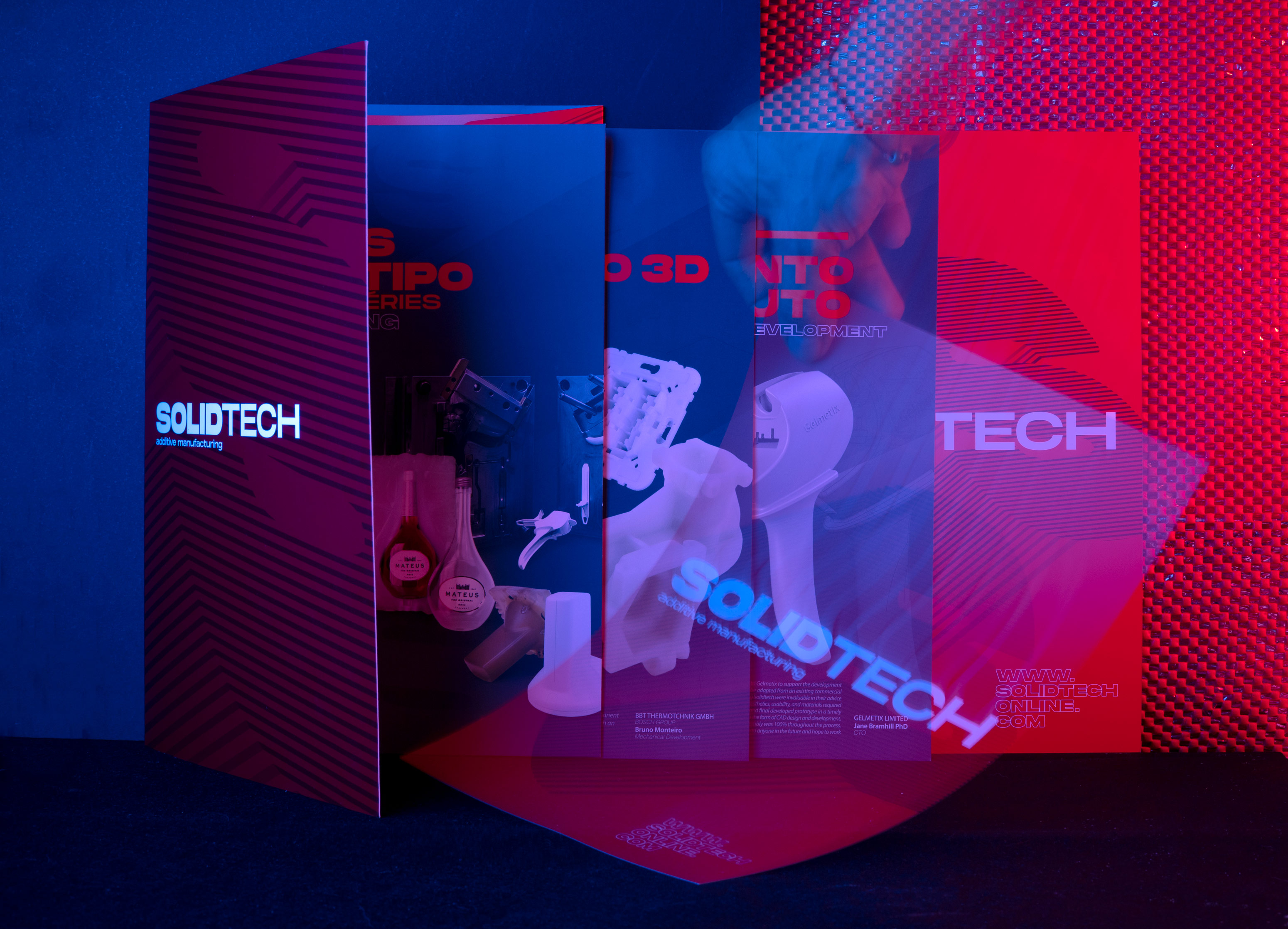
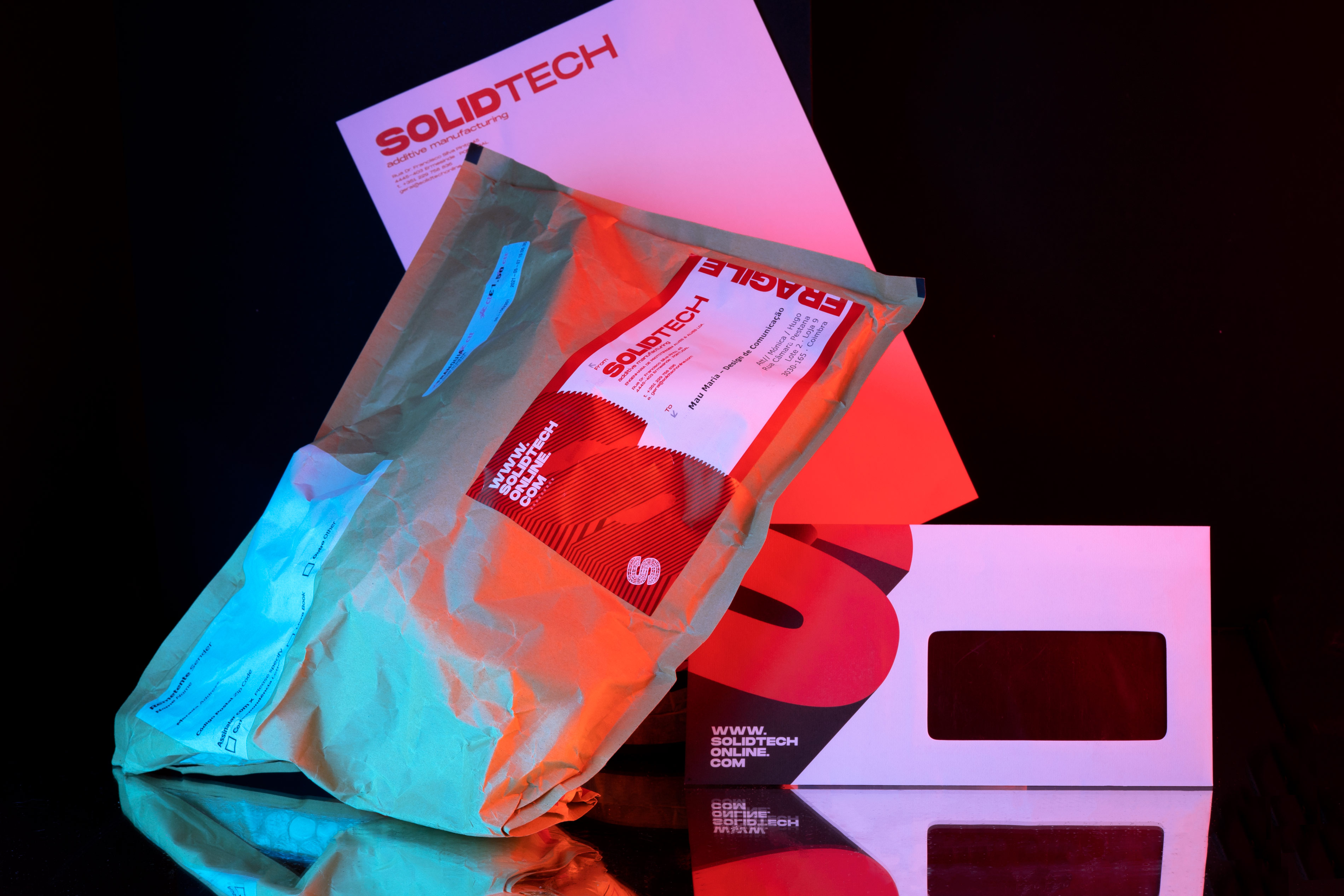
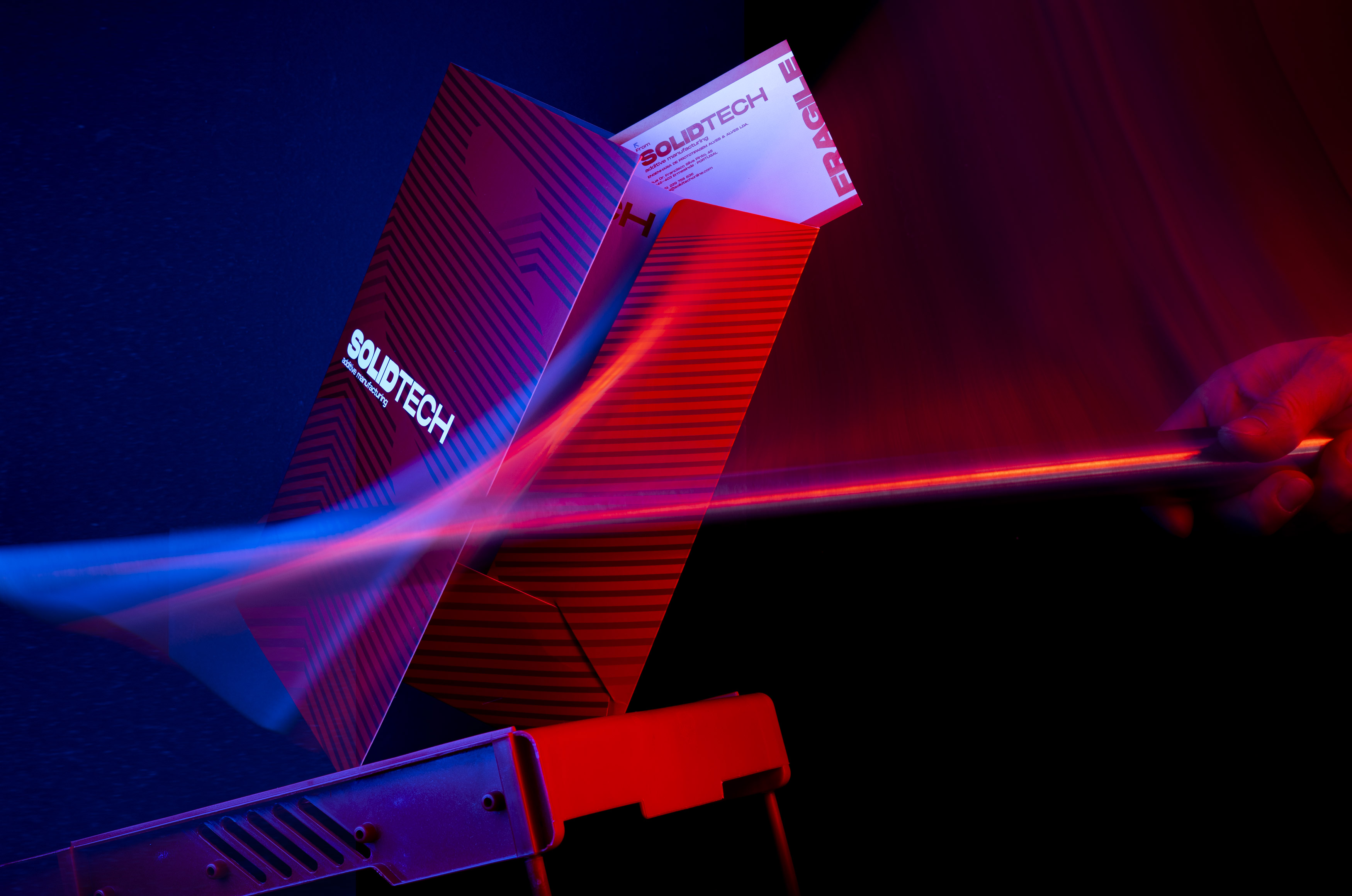
Stationary
The SOLIDTECH rebranding challenge: Reinforcing the brand in a highly technological and niche market.
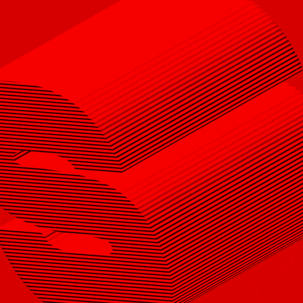
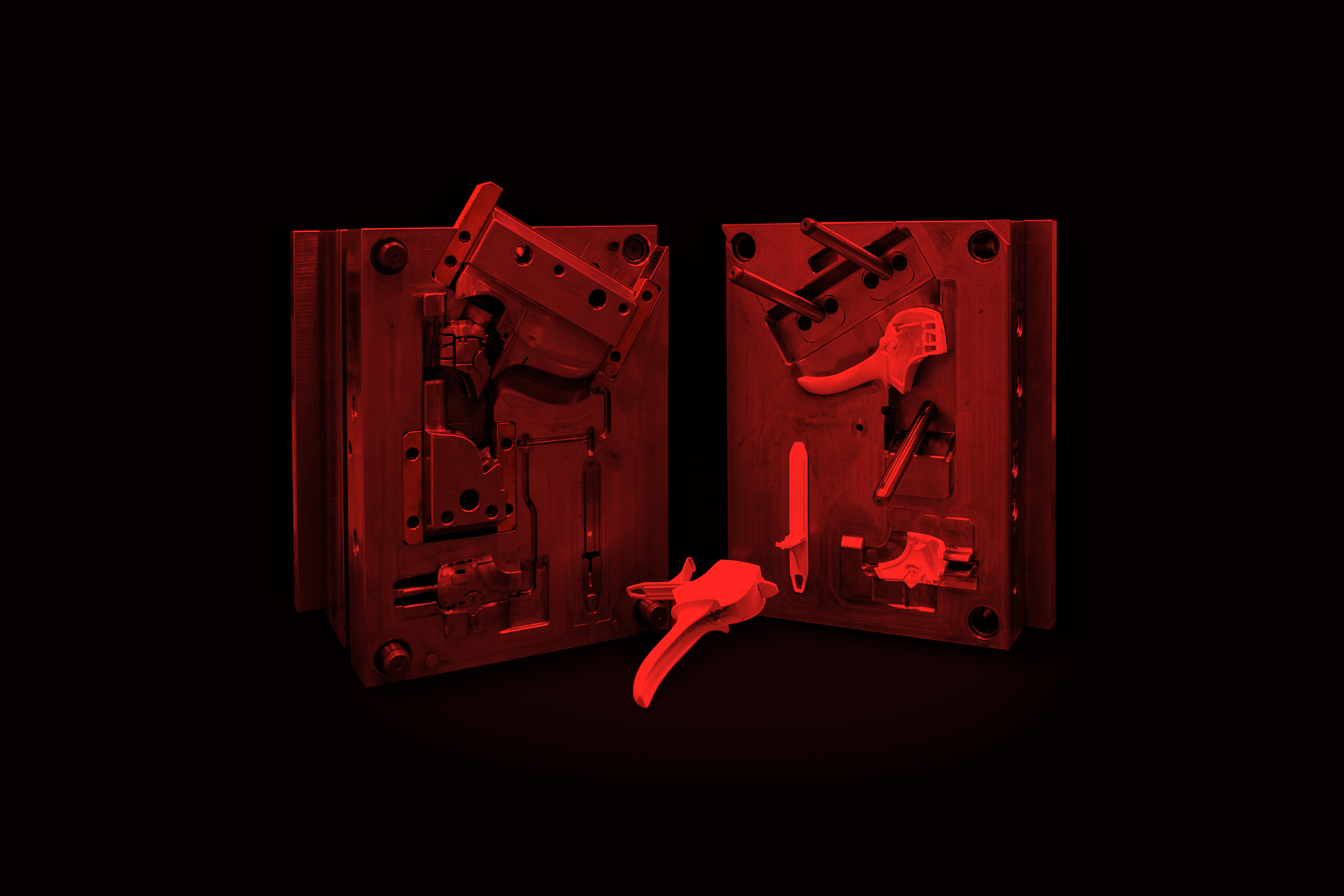
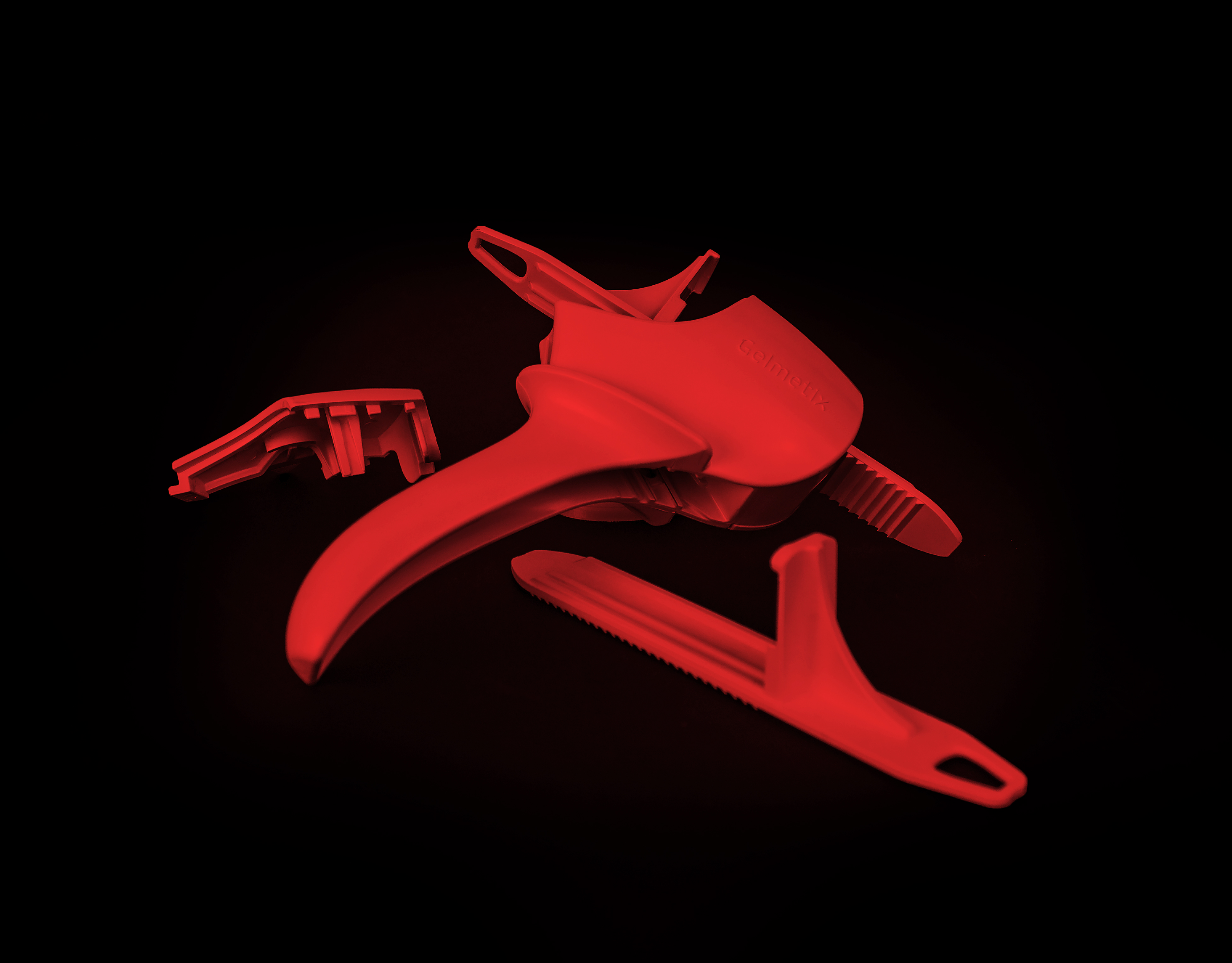
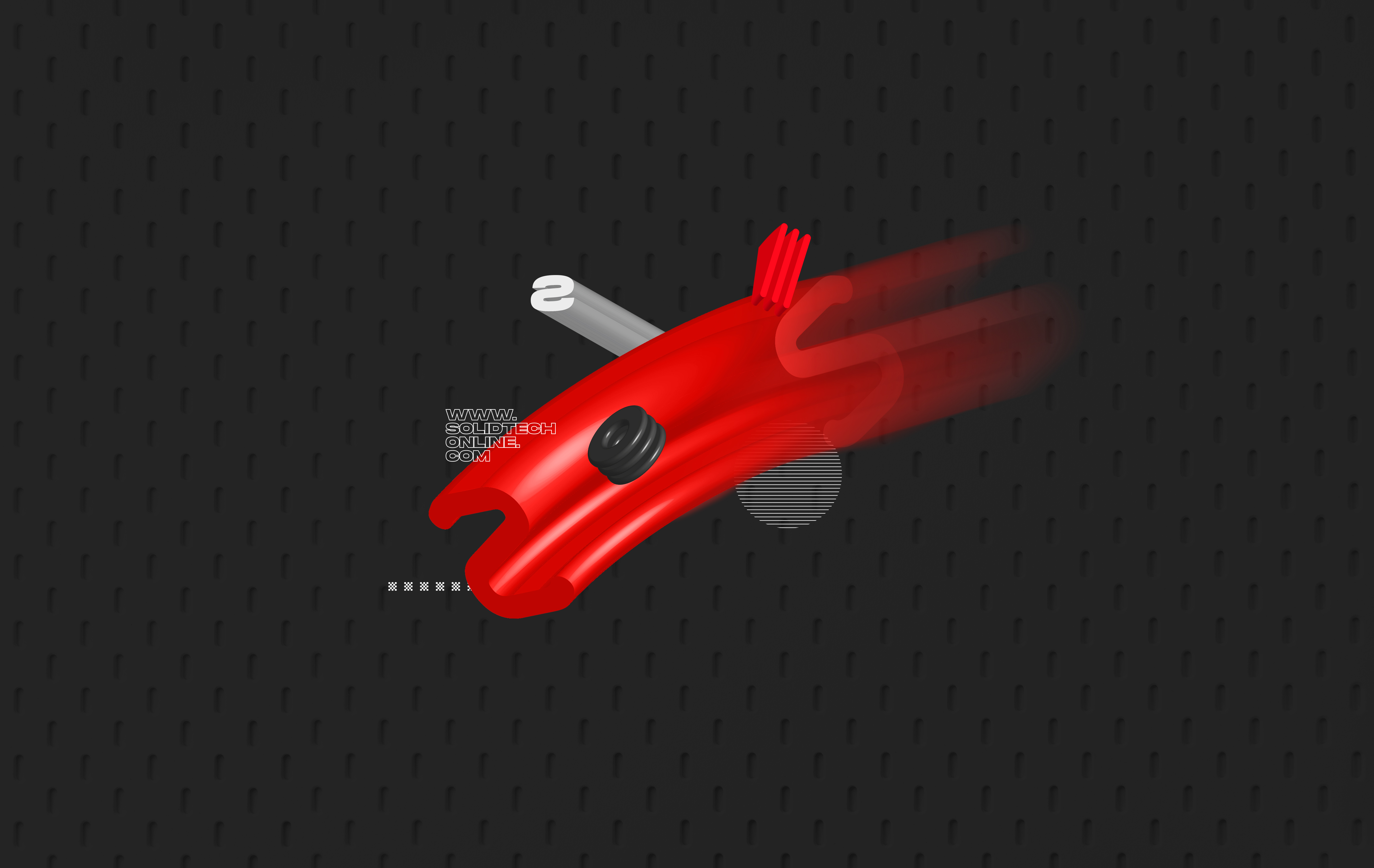
Impossible? Nope. Our aim was to create a language that would reference the additive manufacturing and prototyping industry, where layers and 3d graphics are the guiding hand.
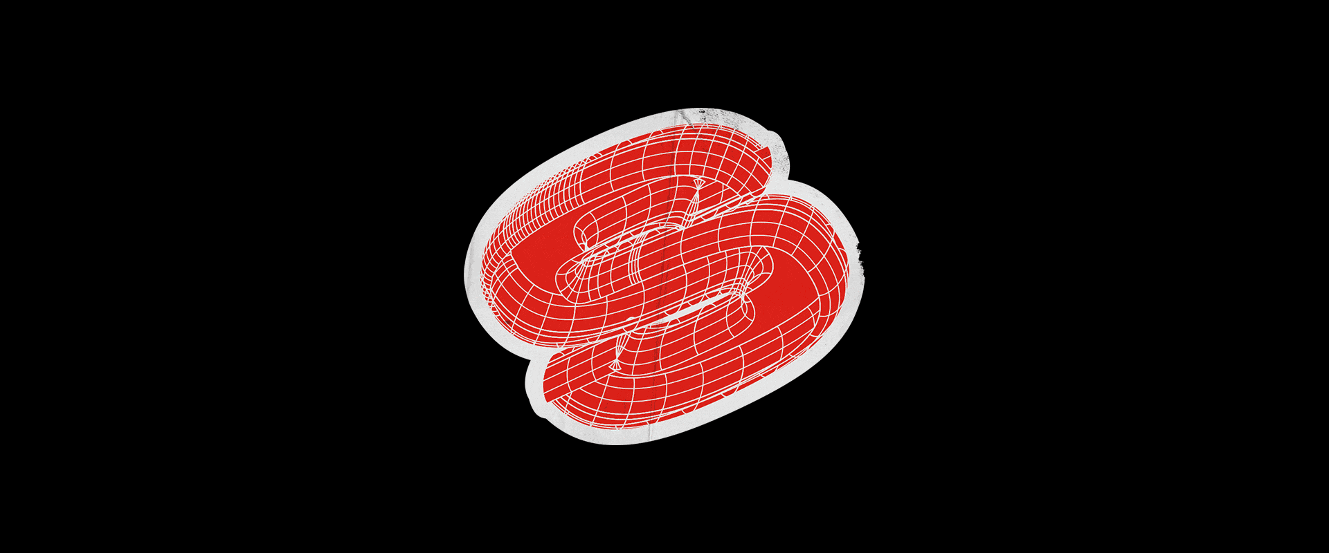
The different letters “S” became the main players in a game of crops, overlays and details that reinforce the brand's strengths, push the limits of corporate and highlight the awesome techniques of prototyping.
The bold, heavy and strong font is THE SOLID. Everything else is layers from different processes.